brief
Overview:
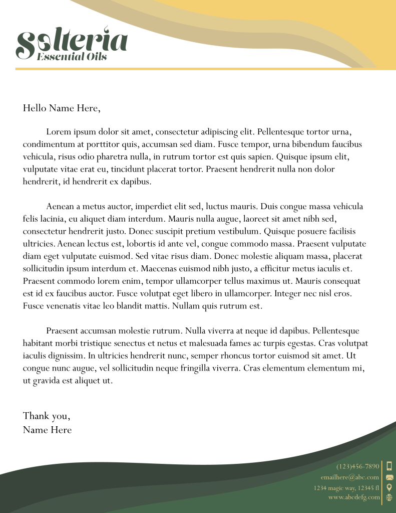
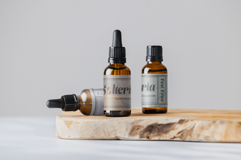
Solteria, an essential oils company that specializes in producing high-quality, natural essential oils. The company’s core identity revolves around the concepts of carefree, nature, and wellness. The primary brand colors are green and yellow, which reflect the company’s commitment to natural products and vibrant well-being.
Objective:
Create a cohesive and visually appealing brand identity that resonates with the target audience, communicates the company’s values, and sets Solteria apart in the competitive essential oils market.
Brand Attributes:
Light, Natural, sleek, trustworthy, boho
Target Audience:
Health-conscious individuals seeking natural alternatives, Modern people with stressful lifestyle, Wellness practitioners and holistic health professionals
Deliverables:
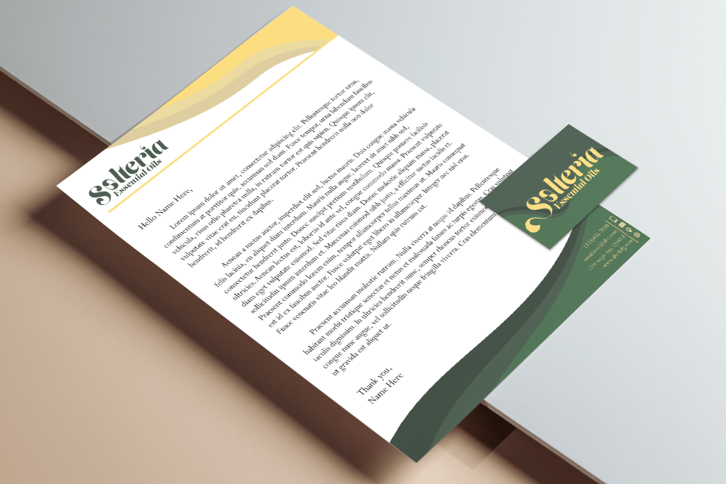
Logo variations , Color palette and typography guidelines, packaging label designs for essential oil bottles, Business card, letterhead, and envelope designs
Process
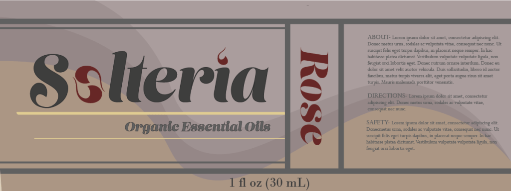
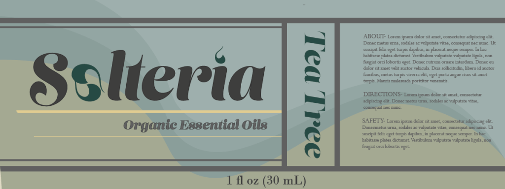
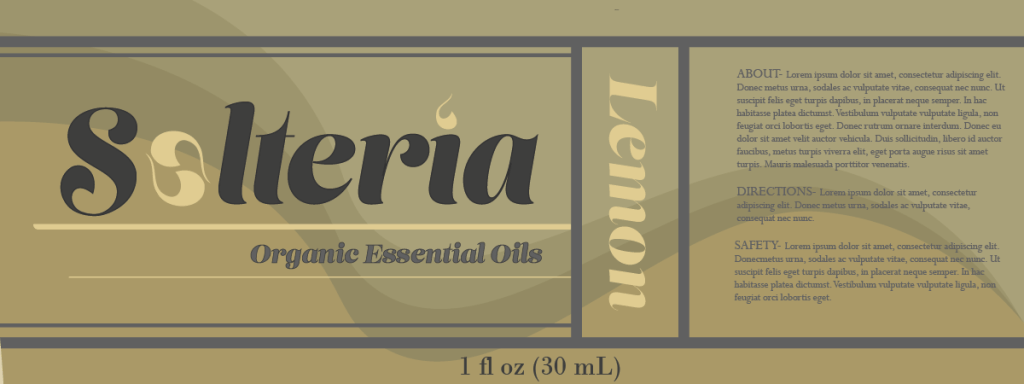
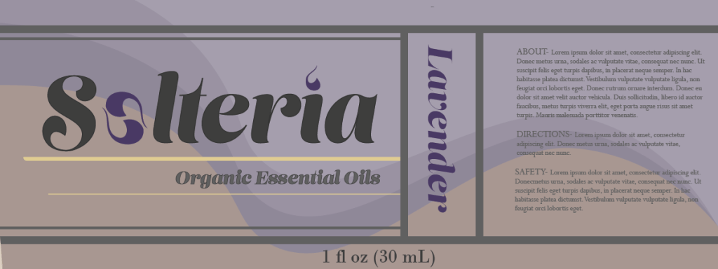
Bringing the “Solteria” brand to your essential oil products is all about embracing a natural contemporary style. I started by looking into market insights and gaining an understanding of potential customers and competitors. This leads me to see the monolithic kind that overtakes this branding, making it easy to make something that stands out but is still clearly that product.
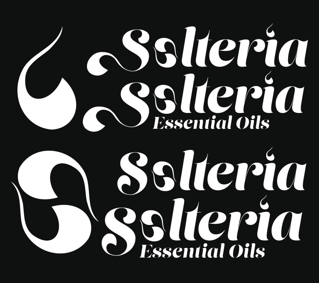
From there, I go from sketching out logo concepts to exploring color schemes, fonts, and visuals that capture the essence of Solteria. From that batch, the actual overall branding takes shape making each subsequent step easier. Once the logo is refined and the pallet picked it becomes about picking design elements. The logo came more from a hippie more boho style, I modified it to create more of a “flow” to focus on the liquidity and ease of use of the product.
From there the continuous use of the slop design was to further go from the logo for a natural elemental feel as Solteria is a very elemental and nature base brand. The sun and ground are represented via color and name, I wanted there to be a further reference to nature elements, which a woosh connects to water and stylized fire.
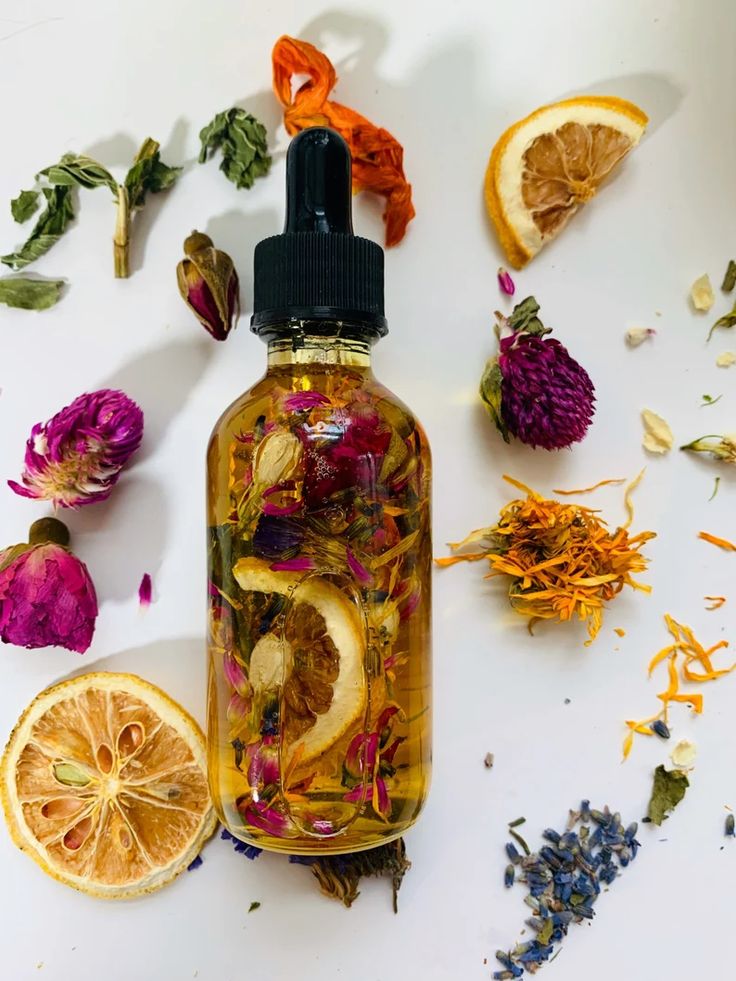
Product