brief
Objective:
Develop a clear interface that any tech uinderstaning level can use. A straighfoward and sharable application that doesnt feel lacking in utility and scope
Brand Attributes:
User friendly, cutsey, fun
Target Audience:
A group of half of dozen friends of mine and personal frustrations. This was a selfish endevour that aids others.
Deliverables:
Mobile interface for one line of task flow and design elements for a brand.
process
Research
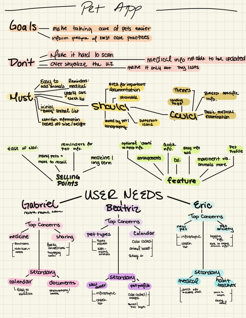
Pet Pal was a fully independent passion project due to personal frustration. One day I voiced an annoyance to friends and recognized that many people around me had similar issues. There was obviously a need for a solution, based on the needs and wants needs of specific people I knew. Aesthetics and user needs were in mind, as I didn’t want to create a product that would look subpar but getting technical feedback was key. This was a type of project where I created personas based on habit, but honestly, as this was a selfish anger and annoyance of a select group I worked with that framework more.
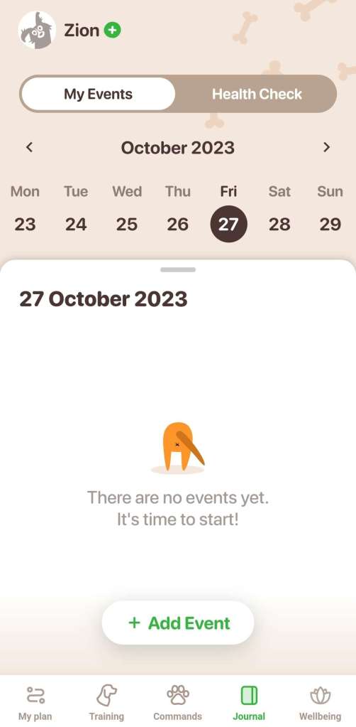
First, I looked for apps revolving around similar ideas, not many popped up, even less without a secondary service need. I didn’t want an app to train my dog or immediately reach a vet, which seemed to be the bulk of what I found. There was a need for a place with reminders, medical info, and some helpful information based on animal species and breeds that’s sharable.
Planning
After recognizing I had to sort through and find the best pieces I recognized my need for prioritization. Without that, the project would spiral and lessen in quality. The need to recognize scope was vital as this was a solo project in my free time and I wanted to work on the aesthetic aspects as well as the technical. Treating it with deadlines as if I needed the deliverables at certain times was necessary as well, as it added a layer of realism.
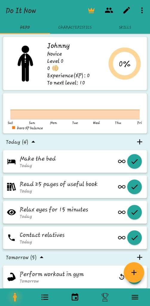
This interface is the amalgamation of a group of half a dozen people’s complaints. The lack of background means I took inspiration from many places Life 360, dog training apps, self-care and improvement apps like Void Pet, and so many more.

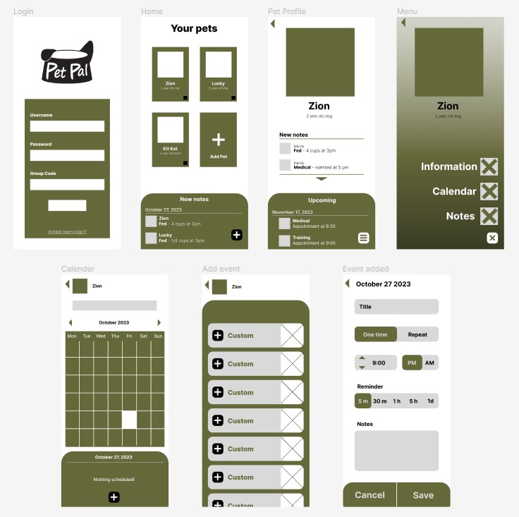
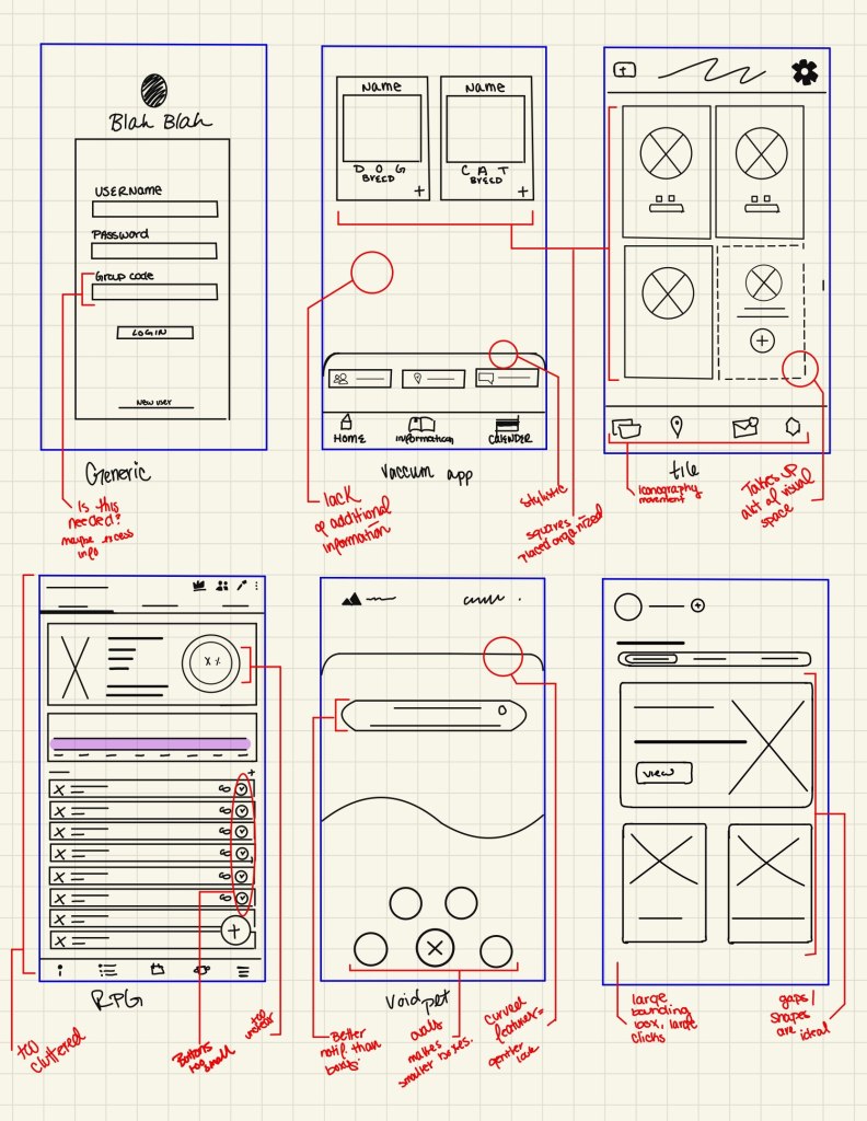
Wireframes- Sketch
This process was quantity over quality to start, this was to gain and gauge opinions of people. These where people who aren’t fully aware of what they want in User interface as they aren’t accustomed to “thinking” about it. I wanted to hear what they innately thought of each interface and how they use it.
Here displays the more polished digital drawings based on the most successful interfaces. This was then a mainly independent adventure for the bulk of the wire framing until the end. I didn’t want to taint the group with more polished designs at this point
Wireframes- Online
After revisions to the prior wireframes I created wireframes in Figma to further finetune structures and have an easier visualization.
These versions also went through a couple of stages of editing based on the group’s opinions, notes were kept in a separate document. This allowed me to take time away as well, of course, i would t forget the interface but the time away allowed me to come in with a fresh perspective more easily
product

Leave a comment