Goals
Objective:
Create a similar enough interface that current Steam users will recognize it that is built through the lends of a new user. This will also touch on some accessibility issues in the interface.
Reasoning:
Ease of use and accessibility
Goal:
Make it easy for my tech illiterate friends.
process
concept
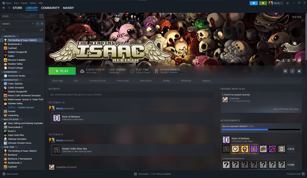
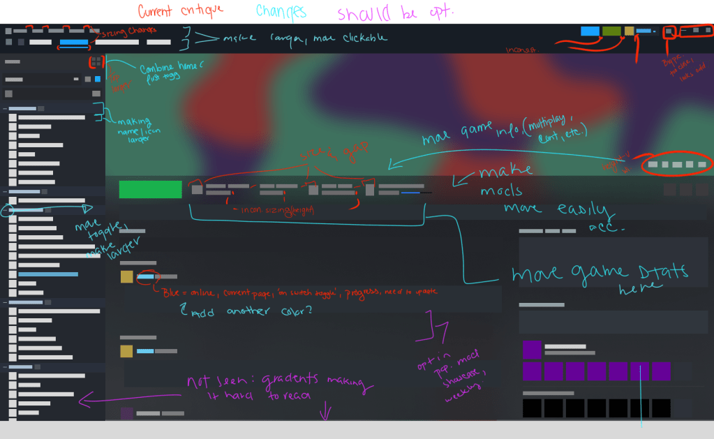
the hierarchy feels a bit odd, when considered through the lens of a new user it makes information hard to sort through with a larger volume of information. Even as an existing user, there are many aspects that get buried and feel out of place when viewed by prioritized needs.
There are issues with the placement of personal game statistics in comparison to general game information, which depending on the game background is invisible. Many of the gradients make it hard to properly click and the size of gaming information and placement makes it hard to clock on for mobility-impaired
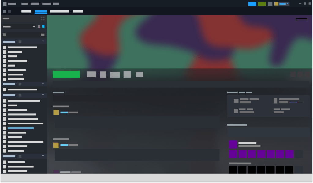
recreations
I decided to create a screenshot in a simplified manner, as this would not be a full project it was key to just focus on the key elements without most of the stylizations of Steam. The main thing is did was remove the excess of gradients that I feel cause difficulty. This also made me more acutely aware of smaller issues that I didn’t catch prior
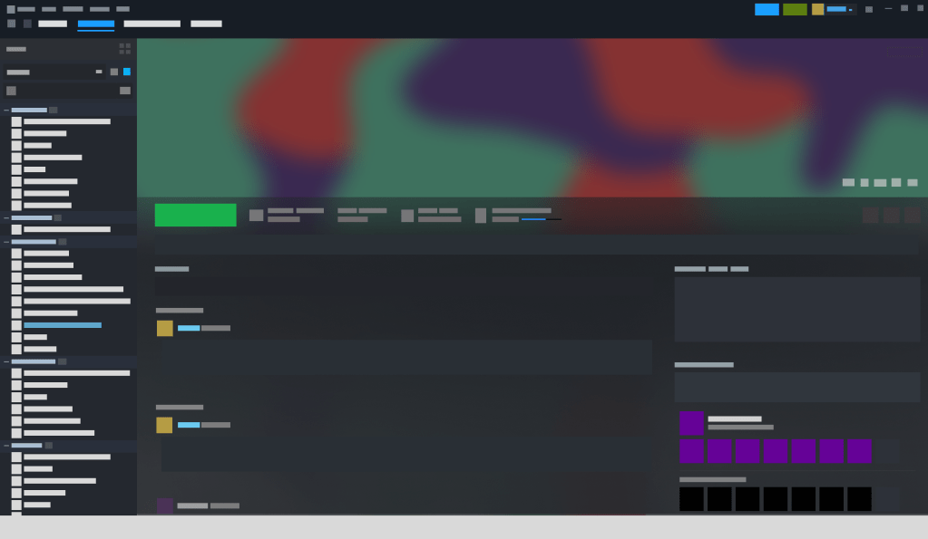
issues
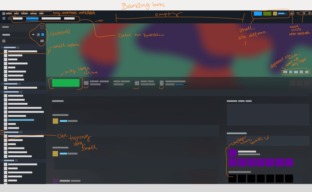
here is where I took my simplified interface and further critiqued it at the “base” information. This was because there was minimal distracting information like the bulk of gradients, glowing, and icon differences. The biggest issue I noted in small sections but didn’t recognize the level of issues is the bounding boxed and scale fluidity. This became glaringly obvious while recreating it, and it couldn’t be masked in this format. The lack of stimulus and the lessening of stylistic aspects of steam created a spotlight.
Once the previous issues were noted there came the ideas of changes, the critiques, and what could be an optional out. There are aspects of the user interface that should have some toggle, and Steam has a couple I think would help with individual needs.
The largest change I wanted to implement is making many aspects of steam larger, this would make it easier both for mobility and clearness. There are many people who use Steam who still have issues finding basic aspects, and that is evident from Google search trends. Aside from that moving the personal game statistics to a different area


Leave a comment