brief
Objective:
Develop a visually compelling brand identity that maintains through it’s interfacing. There is a request for larger appeal that would have to be played into more subtly, like with color theory. A balance of forward facing luxury with details that display its more down to earth and green commitments to be pushed.
Brand Attributes:
Sleek, sophisticated, timeless, investment, affordable luxury .
Target Audience:
Three main archetypes were chosen to display a larger overall userbase. Since wallets are very universally used we wanted to have a widespread than usual as client wanted “broad appeal” while staying within certain aesthetics.
A middle class 20 year old male that is socio-politically conscious and would lean to more modern but conscious brands.
An upper-middle to higher class 45 year old male socially aware with a focus on aesthetics.
A middle class female that has a face pace lifestyle with a focus on practicality and security.
Deliverables:
Browser and mobile interface for one line of user line as well as other possible patterns.
process
Research
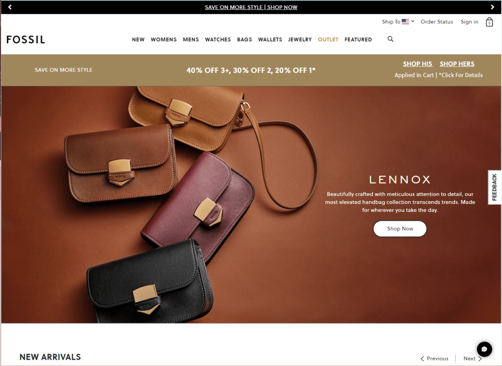
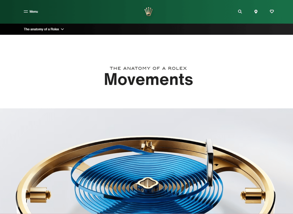
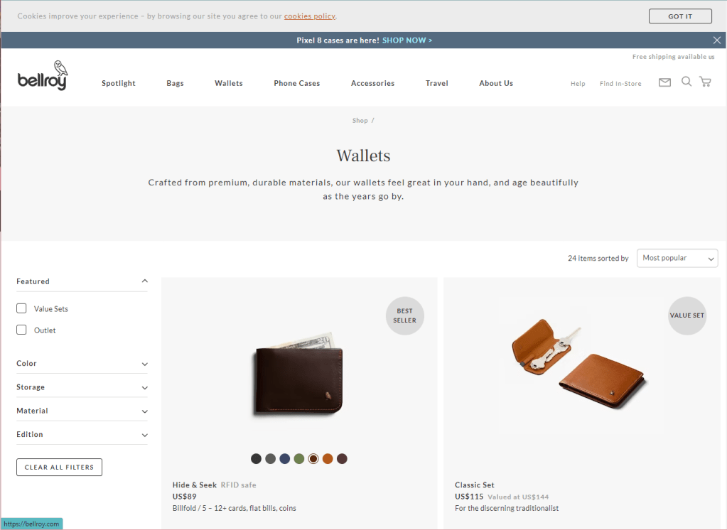
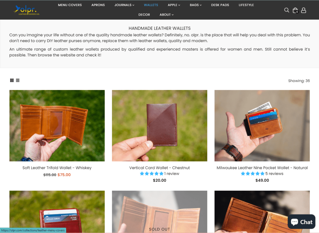
There were two vital initial steps in researching both aesthetics and user needs. Aesthetic aspects were also needed for the graphic design aspects. the in-between point of both those ideas was independent research of trends both in competition but also shopping and UI complaints. There was a specific focus on individual user needs via surveys.
This sample survey is what eventually was synthesized into the archetypes. The questions did include some aesthetic aspects, using comparisons for moods and feeling attached to certain UI decisions that leaned on aesthetic needs. Establishing their priorities and main complaints was the main focus, seeing favored aspects of competitors and the shortcomings that bothered them. There was also questions on accessibility and general usability features that they or loved ones relied on.
Planning
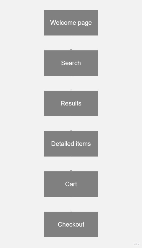
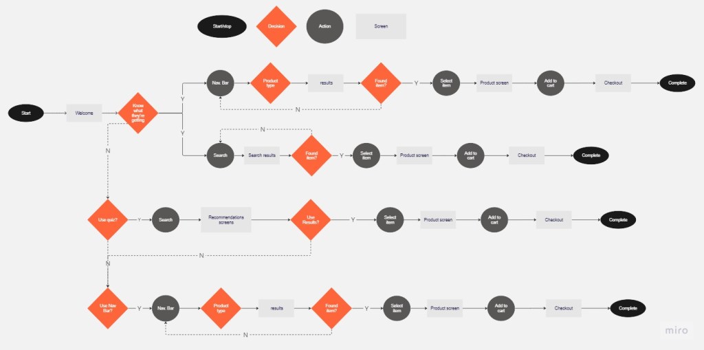
The initial planning was happening in conjunction with research. Creating a user flow and establishing expectations for a task flow, ensured that the end product had a solid end goal.
This framework and expectation was now the lens that I’d focus on and the information on the aesthetic that was found in independent research were the initial building blocks for features. This is when initial wireframing began on paper and would continue being iterated on after surveys returned
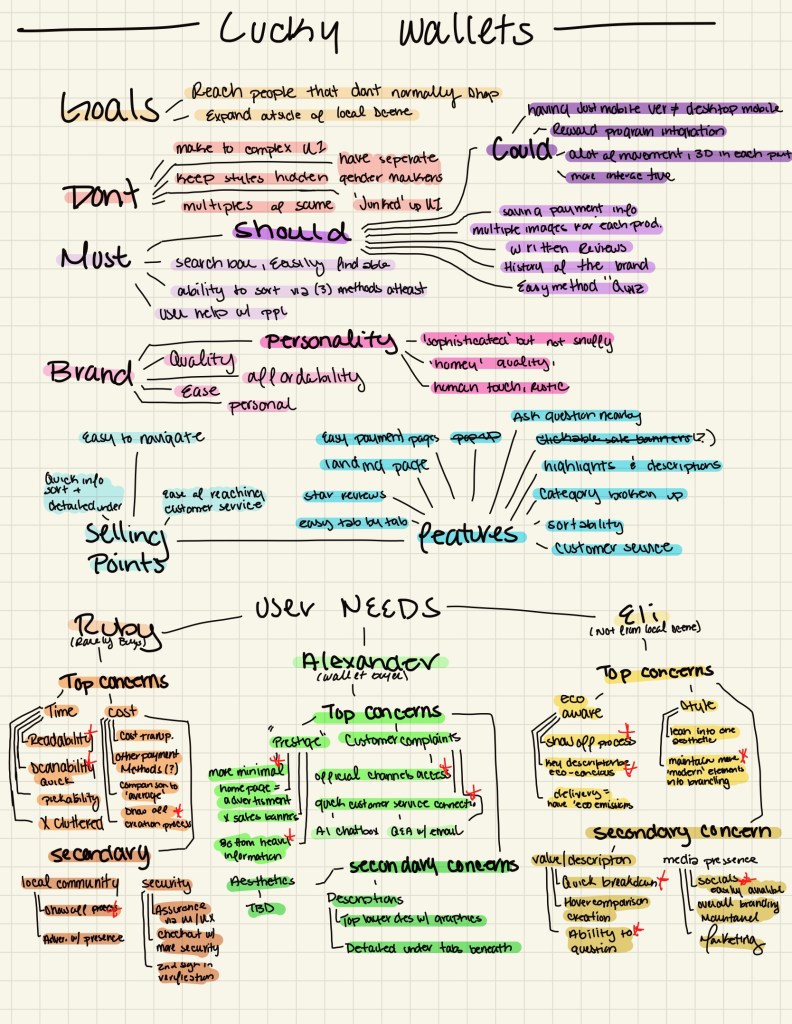
The surveys now informed the personas we developed; Ruby, Alexander, and Eli. We ensured each had needs and wants, they were all created separately with initial ideas of how to tackle their needs. There needed to be a general priority list of what was the most necessary. Lookin at each personas need and also as a group and noting when the same/similar solutions came up to ensure that was pushed forward.
The images beside here show a simplified version of all such information and both the user and taskflow charts utilized.
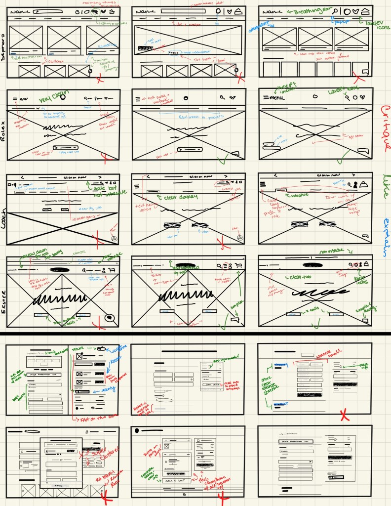
Wireframes- Sketch
As stated in the planning stage the original wireframed based on the independent research before receiving the survey was all done on paper. This process was quantity over quality to start establishing and working through the best iterations quickly
Here displays the more polished digital drawings based on the most successful trends from the previous stage. These were four main structures based on separate competitors. From there a “revision” stage began using the personas that were created. in these images are the short and quick notes, I ensured to do this step after stepping away from the wireframes completely for a day or two while I aggregated and edited images. this allowed a “clean slate” and more objective mentality.
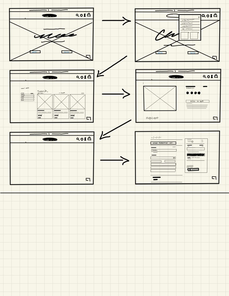
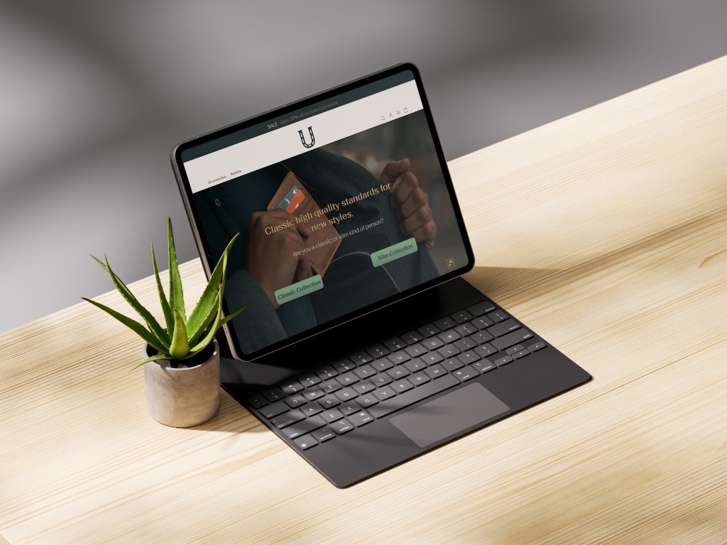
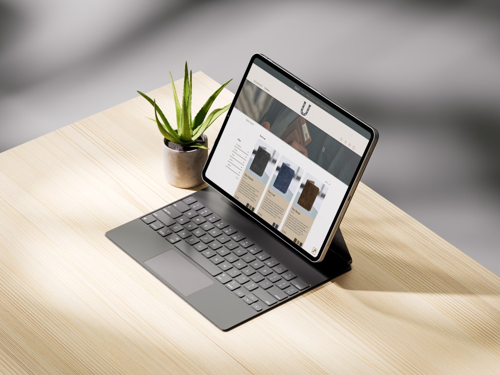
Wireframes- Online
After revisions to the prior wireframes I created wireframes in Figma to further finetune structures and have an easier visualization.
These versions also went through stages of editing, notes were kept in a separate document, to ensure cohesiveness and a consise record. Much like I did prior after major changes, I would take time away, in this case creating the brand. This back and forth also allows the brand and interface to be cohesive as they were made together.
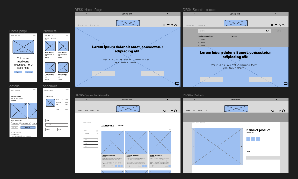
product

Leave a comment